
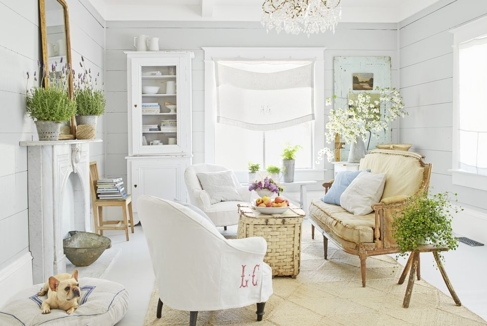
One of the questions I’m asked most by my customers is, ‘How do I add colour to my neutral house?’. For those used to more muted décor, adding colour can be a scary concept.
Whilst a neutral colour scheme is undoubtedly sophisticated, calming and soothing after a hard, busy day at work, sometimes you can feel inspired to add a little vibrancy into your home interior.
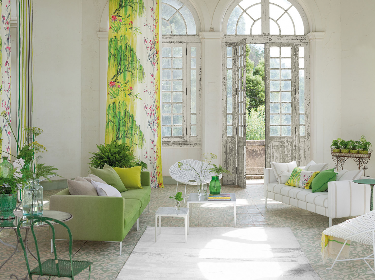
Image credit
Especially with summer approaching, you may want to add a pop of colour to your existing neutral scheme. But, perhaps a lack of confidence means you still find yourself reaching for the ivory or grey cushion every time you go shopping? That’s perfectly understandable – and don’t worry, it’s not an insurmountable problem. You just have to read around the subject a little first and find some inspiration. Start with some of these tips:
Create a focal point
Every room needs several focal points. If you have a neutral living room that feels boring, colour might not necessarily be the answer. Consider adding drama with a statement light fixture, an over-scaled art piece or shapely furniture. They might not be colourful, but they’ll make a statement in the room which is often where neutral living rooms are lacking.
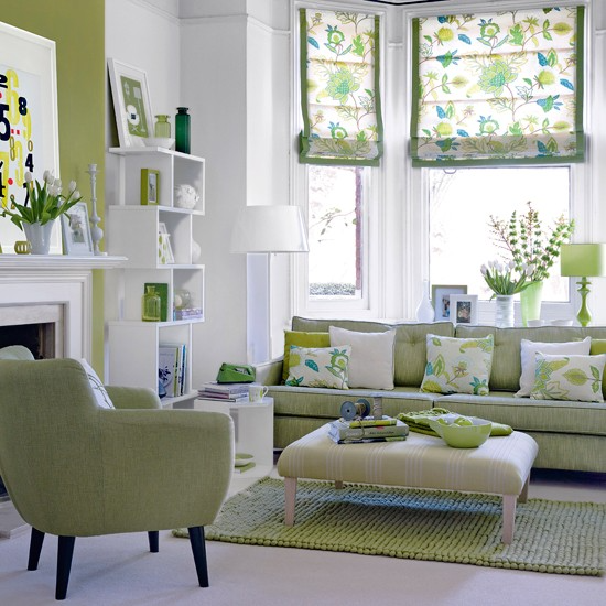
Invest in a colourful rug
Choose the most dominant colour from the rug and repeat it around the room in the form of accessories, such as cushions, a throw, lampshade, accent chair, art and/or curtains (if you really want to go to town). Just make sure it’s a colour you love and is bright enough to be a real contrast with the neutral backdrop.
And, on the subject of backdrop, it’s always a good idea to keep your flooring and big pieces of furniture neutral. That’s because these are the most expensive items to buy. If you get fed up with one colour it’s easy enough to buy new cushions and accessories in another colour, but it would be a pain to have to change things like sofas.
But, back to rugs…the great thing about using a colourful rug is that because it’s on the floor, it will never prove overwhelming.
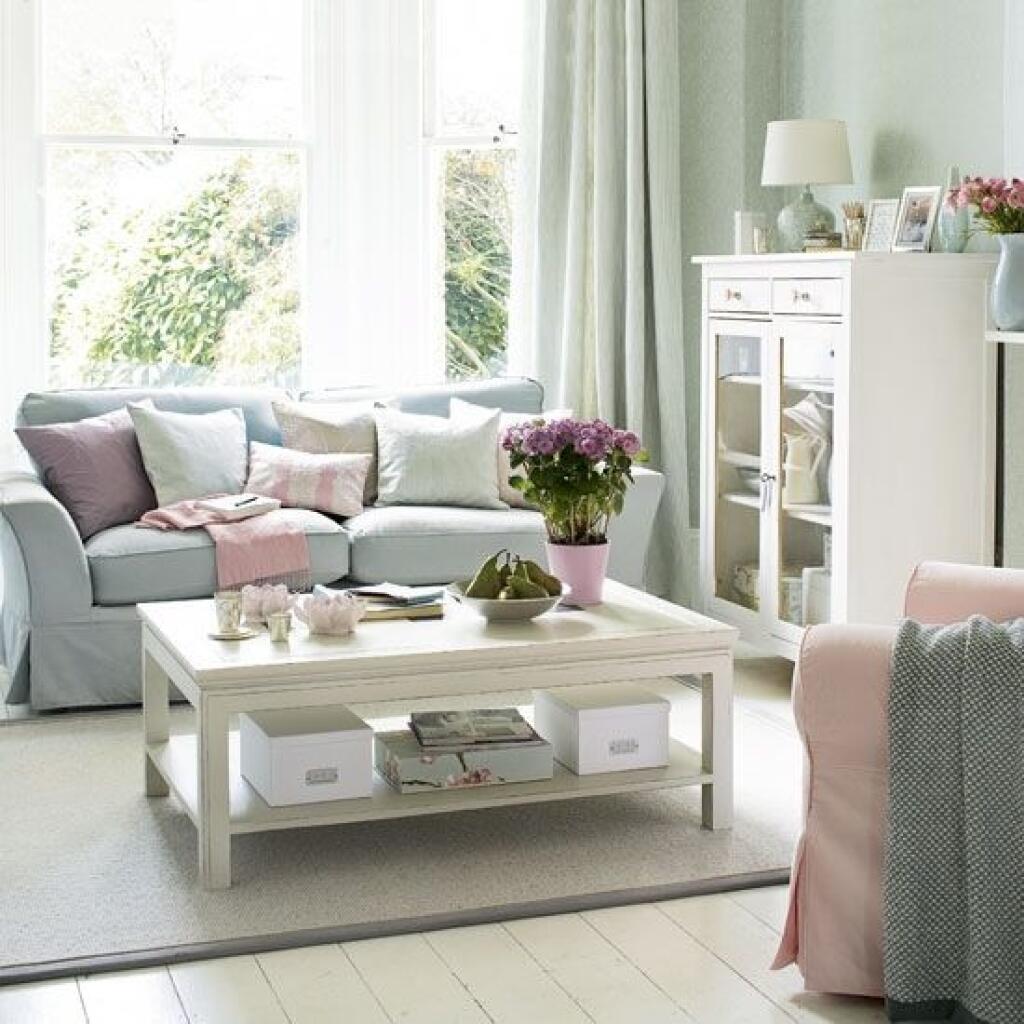
Use accent colours
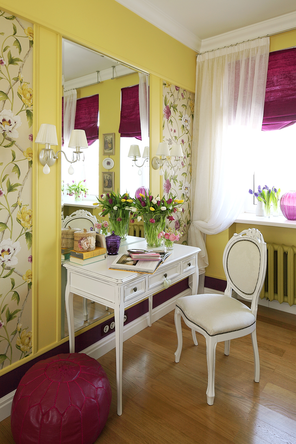
Teals, reds, oranges, yellows and lilacs all work well for summer. Blues and green look great with darker woods or white. Pantone’s colour of the year is a gorgeous purple blue shade with red undertones, which will make a bright and dramatic accent colour for any room.
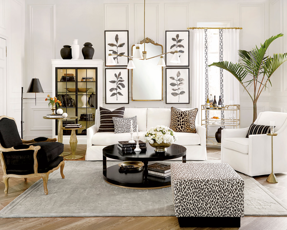
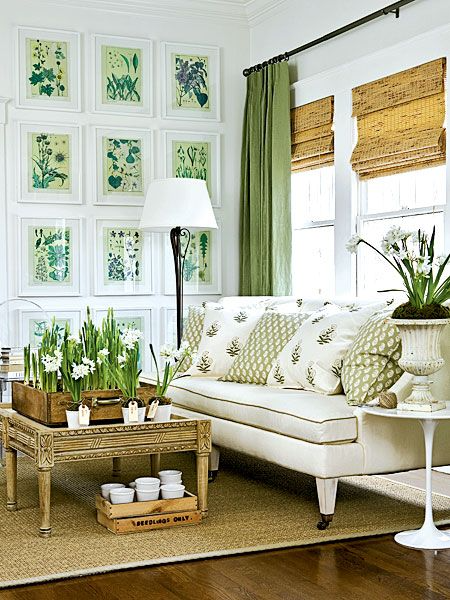
Red is the accent colour in this room (below) while the neutral rug matches beautifully with the cream sofa, light-wood window frames, flooring and white walls. There isn’t a lot of red here, but there’s enough to provide a contrast with the neutral colours. There’s also a little grey mixed in, in the form of the back wall, pendant light shade and painted cabinet:
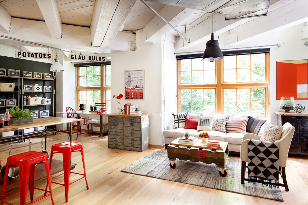
Image credit
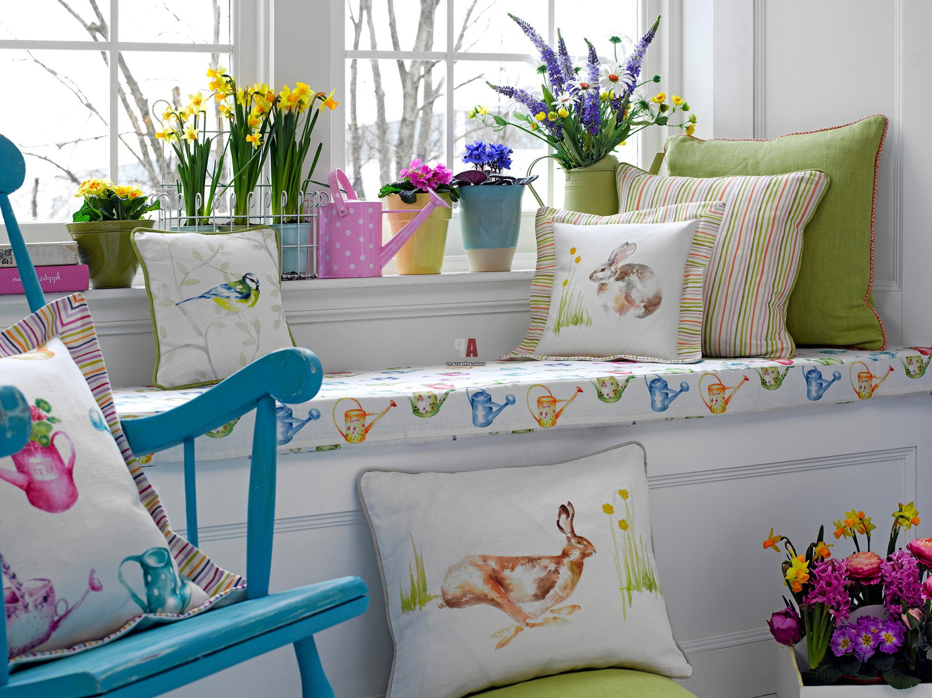
Those nervous about adding colour don’t have to go with a bright or bold shade. It’s fine to add pastels, until you feel brave enough to opt for a dazzling yellow or sunset red.
Patterns are also a good way to add more than one colour and in a subtler fashion, especially if the pattern already contains one of your main backdrop shades. That way it will blend in more easily.
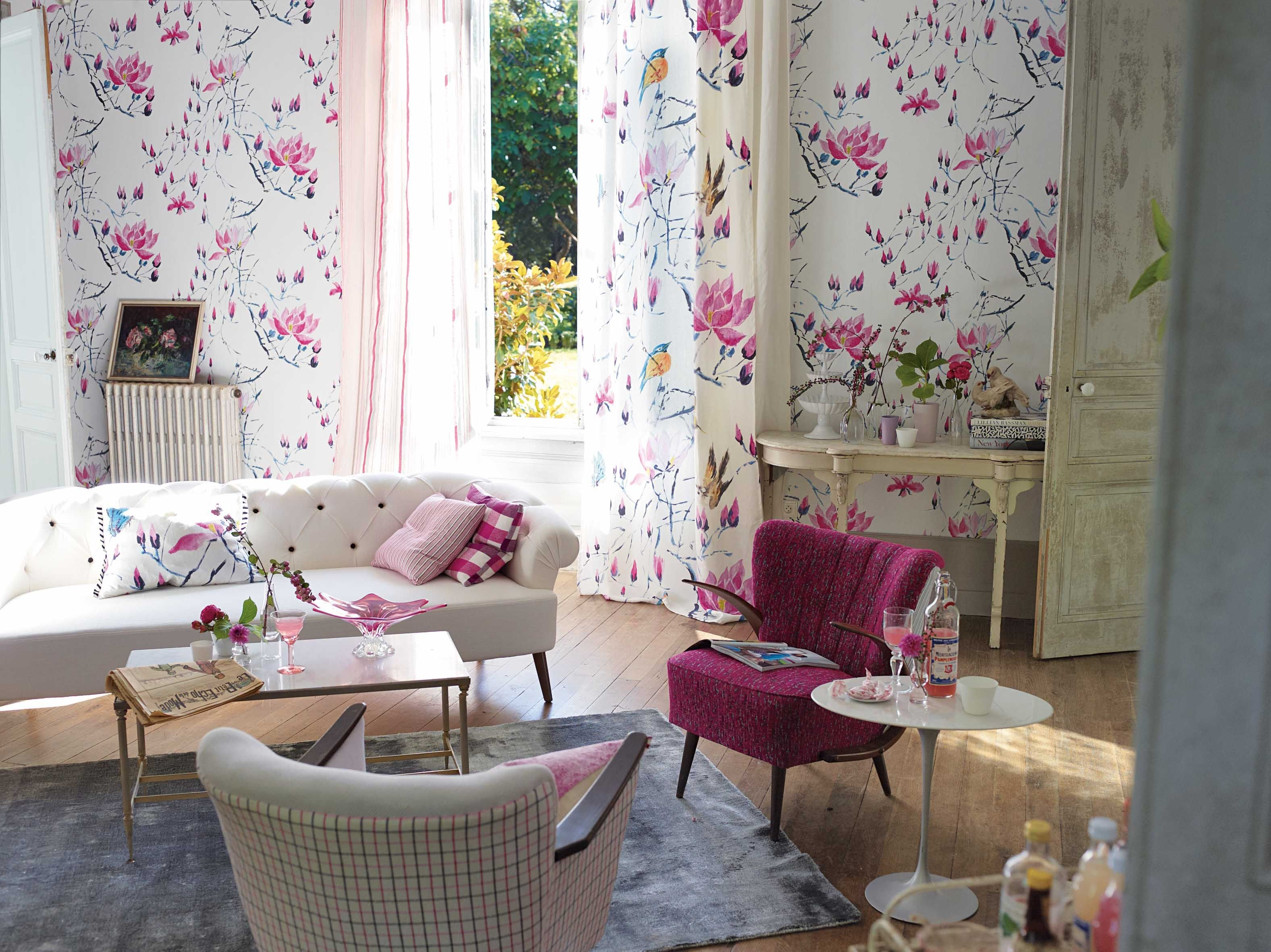
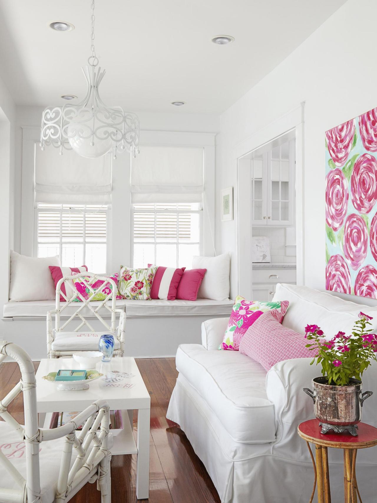
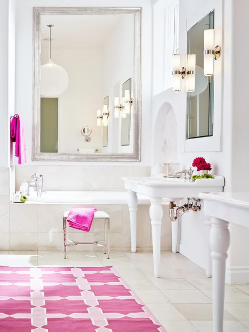
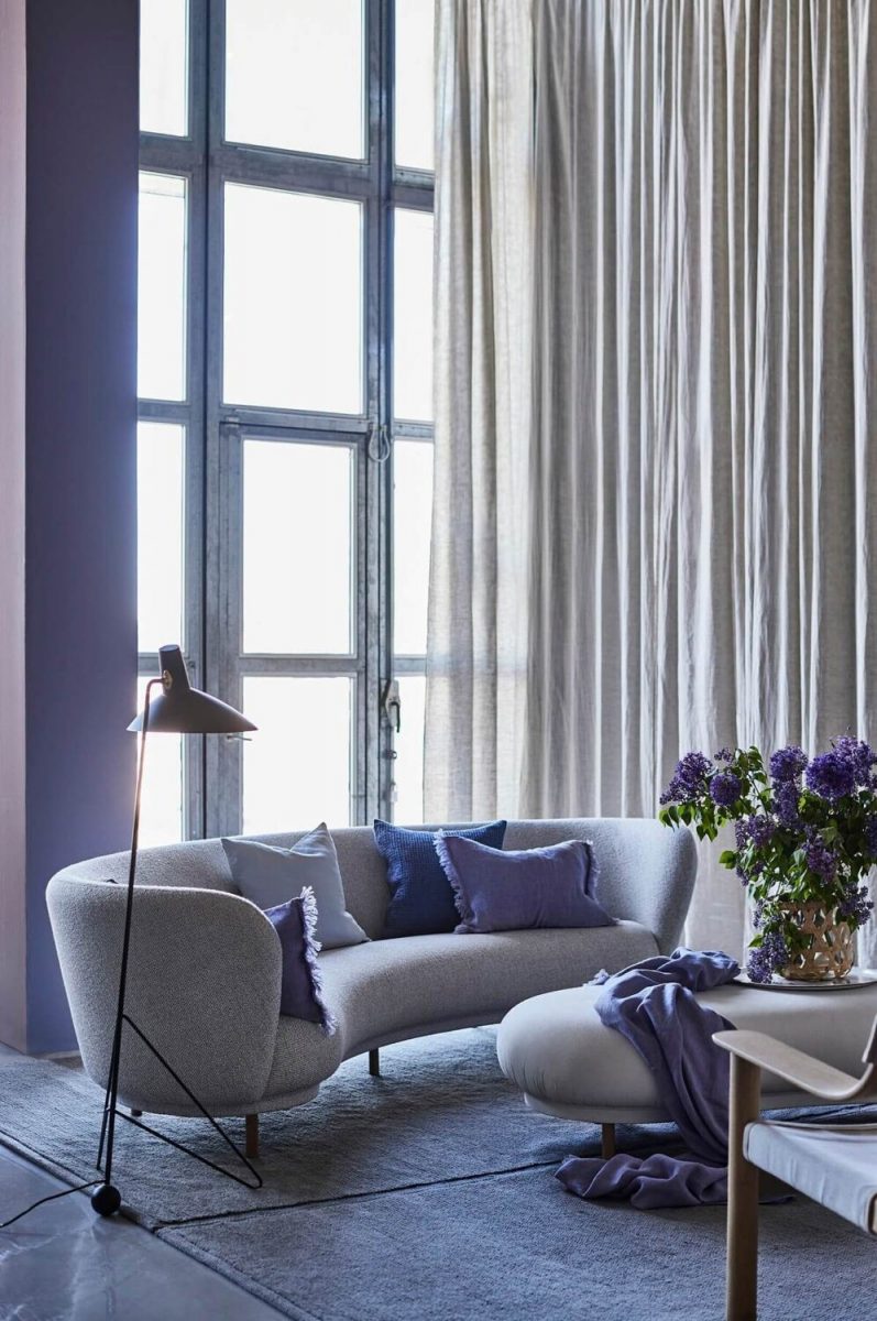
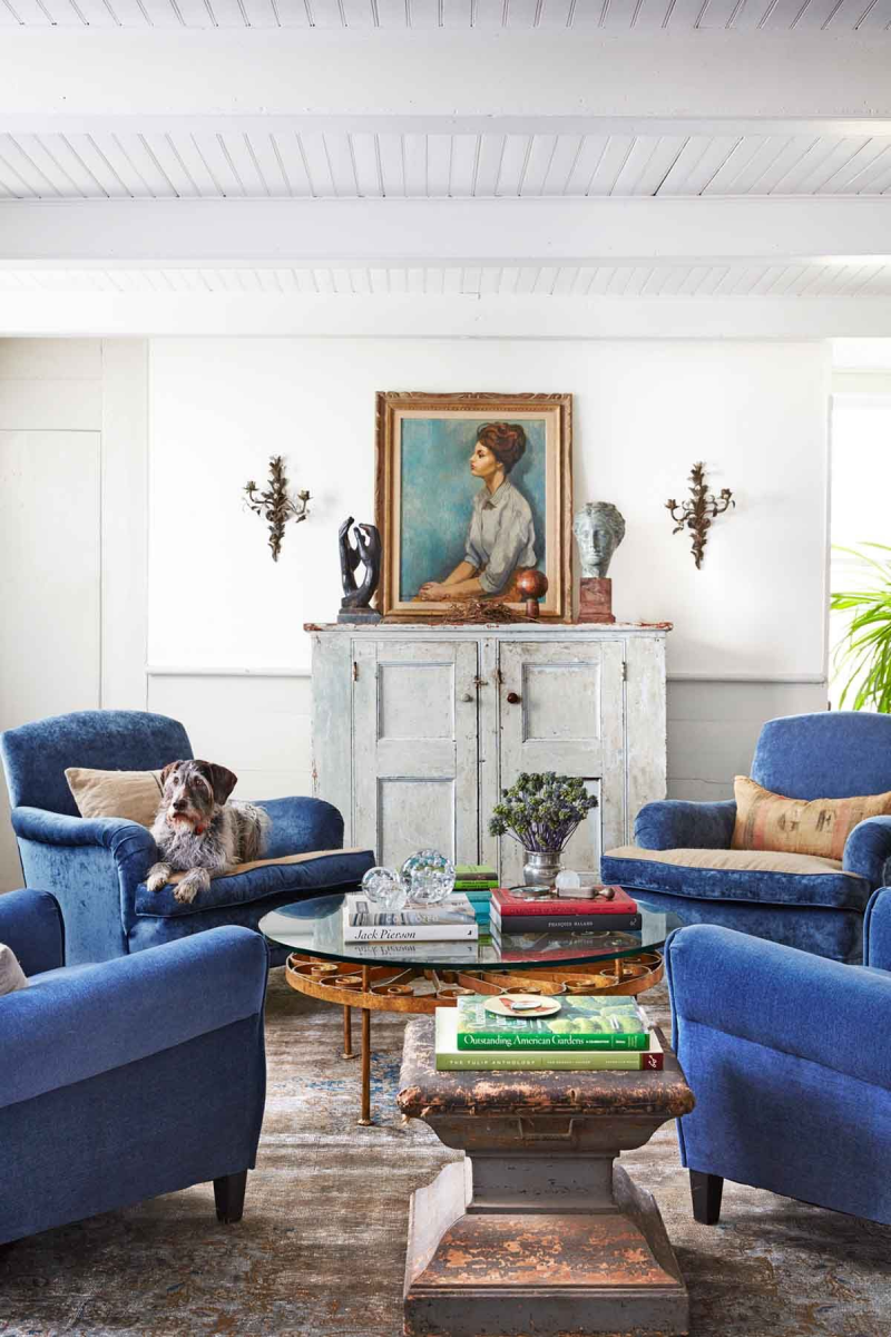
Mixing two strong colours
What if you want ‘pops’ rather than a ‘pop’ of colour i.e. introducing two bold shades? Go ahead, the secret here though is to avoid overkill. There’s just enough blue in this room with the sofa, jar, cushion and rug:
Image credit
When there’s too much colour
How do you know if you’ve overdone the colour thing? Well, if the room feels ‘too busy’ and there’s no white (i.e. neutral space) to rest your eyes on when you scan the room, then you may need to pull back a little with the colour rush.
Perhaps you’ve used the same colour to accessorise with but with different undertones – so that it just doesn’t look right. It’s fine to use different shades of the same colour – in fact, it’s advisable since it provides more depth. But just make sure the colour mix is the same i.e. a green mixed with yellow would look completely different to a green where the second colour is blue.
And, if you’re painting the walls in a bold colour, keep some of the décor a bit more neutral with just a few matching items that give a nod to your painted walls.
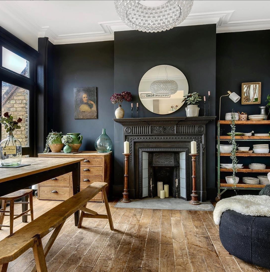
Image credit
Finally
If you’re going bright with the furniture and décor, I’d advise going for neutral walls at first as otherwise if you’re not used to bold colours, it may feel overwhelming.
If you’re looking to add colour to your neutral interior, then do come and have a browse and take a look at some of our colourful accessories at Caroline Jane Homeware today. There you’ll also find plenty of inspiration for your next room makeover and if you’d like help putting together an interior mood board, don’t hesitate to ask.


